Sierra Overlook Animal Rescue — Website Optimization
A nonprofit animal sanctuary in California needed help making their website actually work for the people visiting it. Here's what I found, what I changed, and why.
The Problem
Sierra Overlook Animal Rescue (SOAR) is a 501(c)(3) nonprofit in Somerset, California. They take in animals who are elderly, special needs, or just hard to place — the ones other rescues pass on. Their website is how they get donations, find adopters, and recruit volunteers, so when it's confusing to navigate, it directly affects the animals.
The Executive Director reached out for help identifying what wasn't working and fixing it. I came in as a volunteer, reviewed the full site, and built a prioritized plan around her goals.
For clarity, everything below is SOAR’s live Wix site only. I also maintain a separate WordPress practice build (Happy Tails at janechavez.org), which grew from a short WordPress.com experiment into self-hosted WordPress with Elementor—that project is under Work and is not SOAR’s production stack.
Starting With What Actually Matters
I didn't jump straight into making things look different. I started with a call, went through the stakeholder's full priority list, and built a phased work plan — homepage first since that's where most visitors land, then support pages, then events and extras.
Each session I documented what I worked on, how long it took, and any decisions I made. If something wasn't possible in Wix, I flagged it clearly instead of breaking something trying to force it.
Getting Rid of the Hamburger Menu
On desktop, the site was using a hamburger menu — the three-line icon that hides all your navigation behind a click. That's fine on mobile, but on a full desktop screen it just makes people work harder to find pages. A lot of visitors won't bother.
I replaced it with a horizontal nav bar, cleaned up the menu items, renamed them to be clearer, and removed some leftover Wix icons that were cluttering the header for no reason.
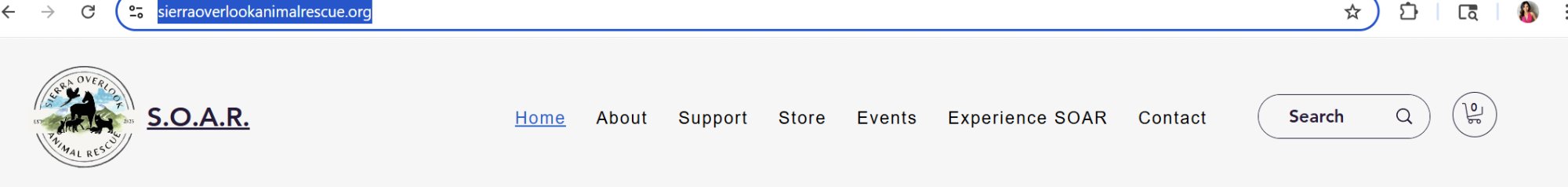
After ↗Every page visible on load — no extra tap required
Fixing the First Thing People See
The homepage hero was a bit of a mess — the org name on the left and the donation widget on the right were fighting for attention without clear hierarchy. Text was hard to read against the background and the buttons didn't stand out. Not a great first impression for a nonprofit asking people to donate.
I worked on the balance between the two sides, added text contrast, tightened the spacing, made the CTAs more prominent, and pulled Community Events off the homepage entirely — it was adding noise and the homepage should stay focused on what SOAR actually needs: donations, adoptions, and volunteers.
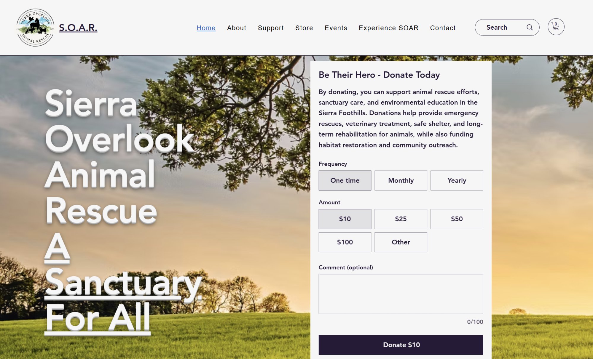
After ↗Cleaner layout, readable text, donation widget balanced right
- Text contrast — Added shadow so the heading reads clearly against the background photo
- Layout balance — Adjusted the split between the org name and donate widget so neither dominates
- Donation box — Reduced oversized widget height to improve proportions
- Button visibility — Made Learn More and Shop Now more noticeable
- Homepage focus — Removed events block to reduce noise; still one click away in nav
Making the Layout Easier to Scan
The services were in one long single column — users had to visually trace wide rows to connect a service name with its button. More work than it needs to be. I restructured it into two columns with better spacing so everything is shorter to scan and easier to act on.
This screenshot also shows the updated footer. The original had incorrect links and no social media icons. I added the mailing address, phone, email, and working links for TikTok, Instagram, Facebook, and Etsy.
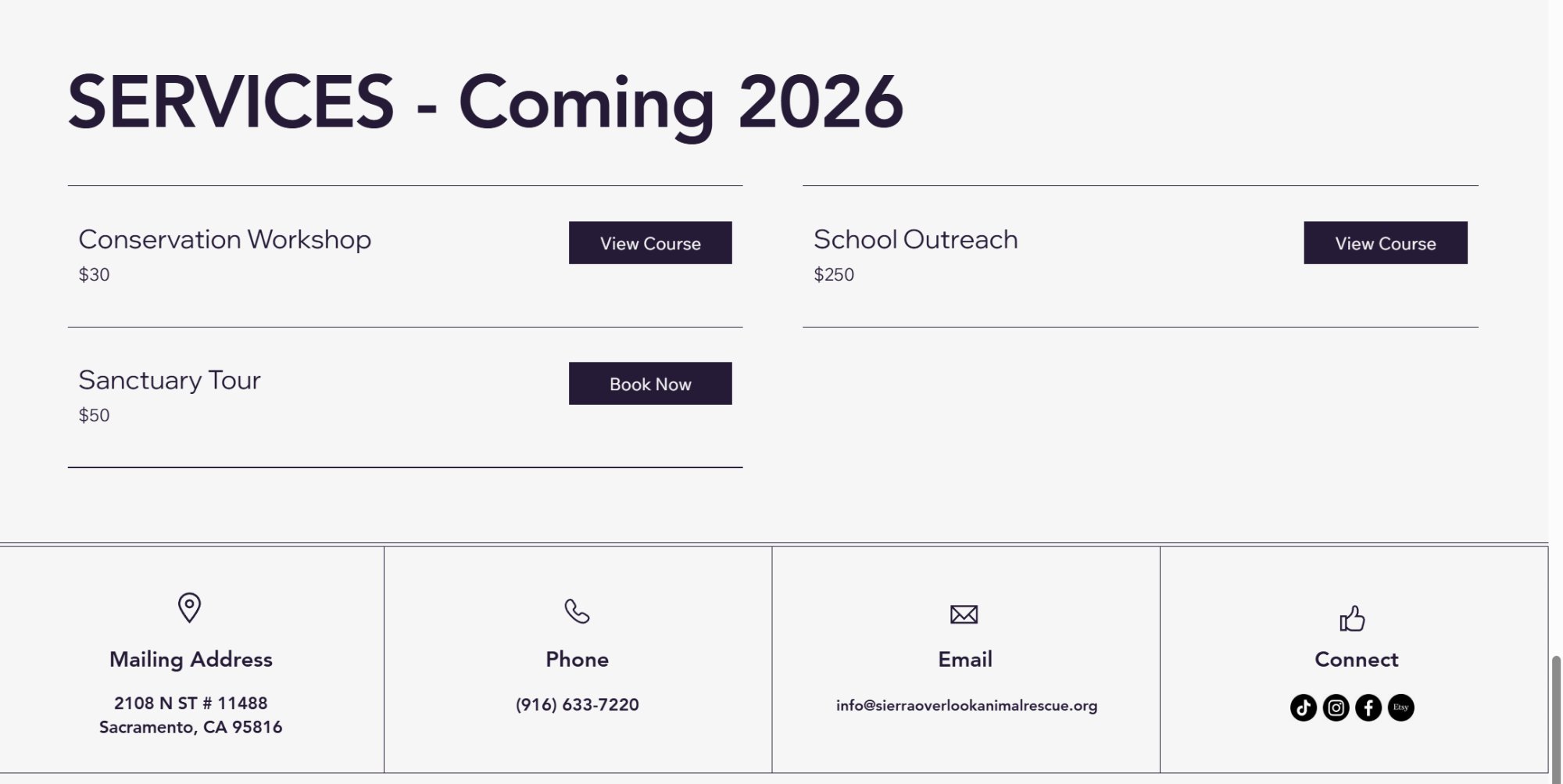
After ↗Two-column layout + footer with real contact info and active social links
Clearing Up the Confusion
The events page showed past and upcoming events the exact same way — no labels, no visual difference. Someone showing up to find something to attend had no way to tell what was still happening. I improved button visibility, fixed a cropped image on the Dessert for the Animals event, and looked into whether Wix could auto-separate past and upcoming events. It couldn't with the current setup, so I laid out two options for the stakeholder to decide on.
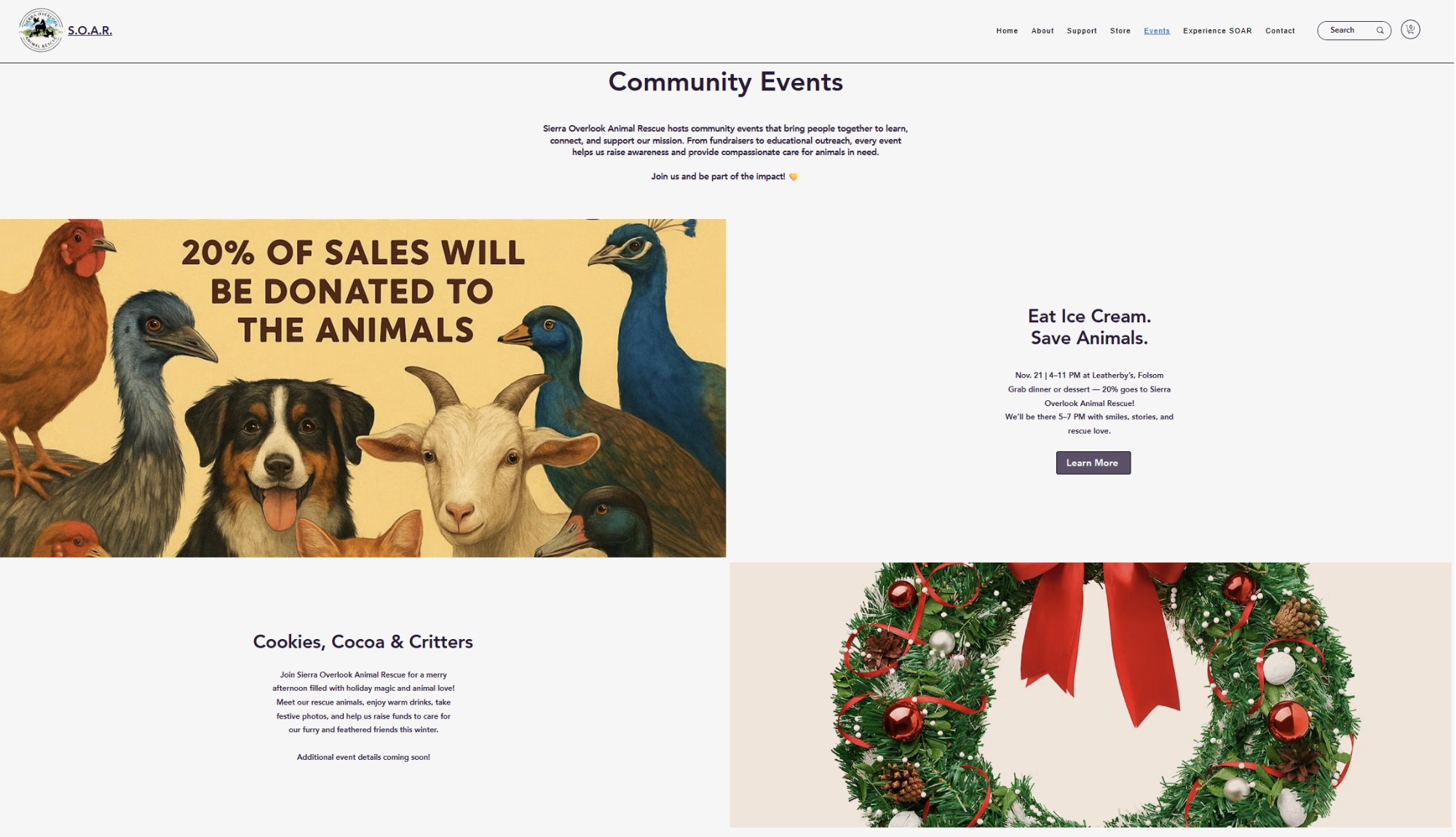
After ↗Events page — better button visibility, image cropping fixed
Knowing What You Can and Can't Control
"A few things on the priority list turned out to be locked by Wix — the store's Read More toggle and Sort By position are both platform-controlled with no override available. Trying to force them could break the store. I documented this clearly and communicated it rather than shipping something fragile. Part of doing good UX work is knowing when to say this isn't possible here, and explaining why."
Still in Progress
This project is ongoing — changes are saved in Wix and waiting on the stakeholder's final review before going live. There's still work to do on the About page, more design polish, and a few remaining footer items.
Working on a real nonprofit site with a real stakeholder is different from a class project. Priorities shift, communication matters, and sometimes the most useful thing you can do is document a decision clearly instead of making it for someone else.
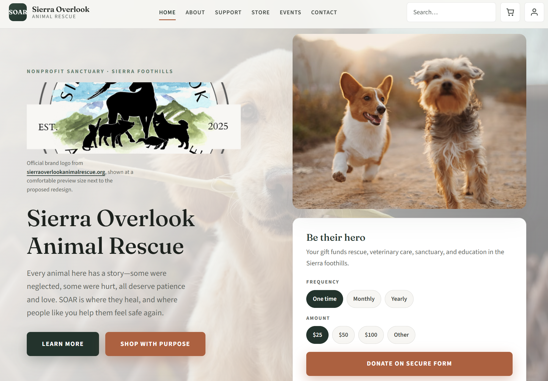
What I'd Build Without Platform Constraints
Working within Wix meant accepting certain limits — layout flexibility, component control, and code access were all platform-governed. That's a real and important lesson. But I also wanted to explore what SOAR's site could look like if those constraints were lifted entirely.
So I built one. From scratch. No page builder, no platform lock-in — just semantic HTML, CSS, and vanilla JavaScript, hosted on GitHub Pages. The goal wasn't to replace the Wix work or go around the stakeholder. It was to push my own thinking further and show a fuller picture of what I can design and build independently.
What the redesign includes
- A full multi-page experience across Home, About, Support, Store, Events, and Contact
- Desktop-first navigation layout replacing a hamburger-style pattern so core pages are visible at a glance
- Redesigned hero with clearer hierarchy, mission framing, and donation focus that feels intentional rather than overwhelming
- Foster-to-adopt profiles presented in a consistent visual system, with cleaner scan patterns and contact flows linked to SOAR's live email
- Three-pillar initiatives section rebuilt with stronger visual cards, improved typography, and clearer calls to action
- Community partners section styled to feel integrated and credible, not visually heavy or overly promotional
- Events experience organized with clearer status and category framing so visitors can quickly separate live, upcoming, and past events
- Services and programs section with live booking links that route back to SOAR's real Wix pages
- Footer modernization with accurate contact info and active social links, replacing the boxed, fragmented look from earlier layouts
- Fully responsive behavior across desktop, tablet, and mobile, plus an explicit unofficial-demo disclaimer throughout
All donation flows, store links, and booking pages point back to SOAR's real Wix site — this demo never intercepts real transactions or misrepresents the organization.
View redesign demo ↗ — Unofficial redesign demo · Full multi-page build · HTML / CSS / JavaScript
Why this matters alongside the Wix work
The Wix engagement taught me how to work within real constraints, align with a stakeholder, and ship practical improvements to a live nonprofit site. This redesign let me push the same content and mission through a more deliberate UX lens: calmer hierarchy, stronger visual consistency, and clearer user pathways from landing to action.
Together, the two tracks show range: I can improve an existing platform responsibly and I can architect a fuller front-end experience when the constraints are removed. The redesign remains clearly labeled as an unofficial demo throughout, and all operational flows still route back to SOAR's live platform.