Selected Work
Summary
Flagship React build: a concept home-and-lifestyle shop I designed and shipped as a working SPA—visitors click through real commerce patterns, not static comps. Deeper story (goals, embedded Figma, GitHub Pages routing, optional Supabase vs. demo mode) lives in the case study.
Highlights
- Experience — Shoppable catalog through checkout, trust pages, and a signed-in account area in one repo.
- Craft — Editorial UI with design tokens and motion; prototype and implementation stay aligned.

Summary
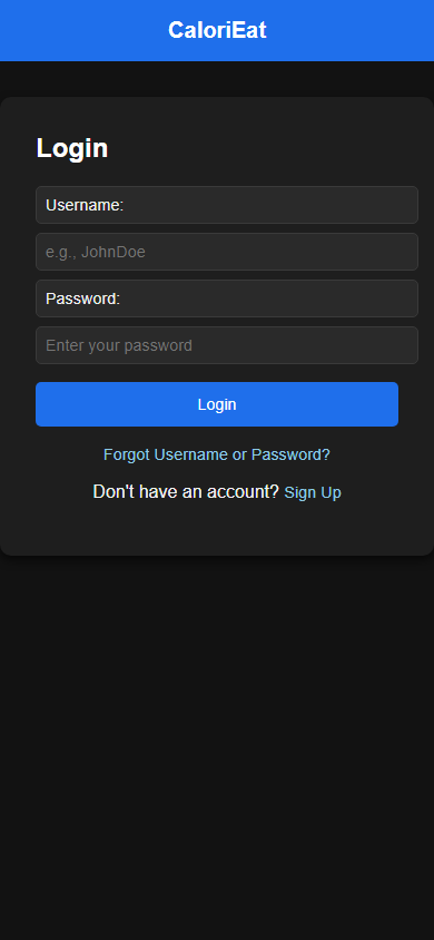
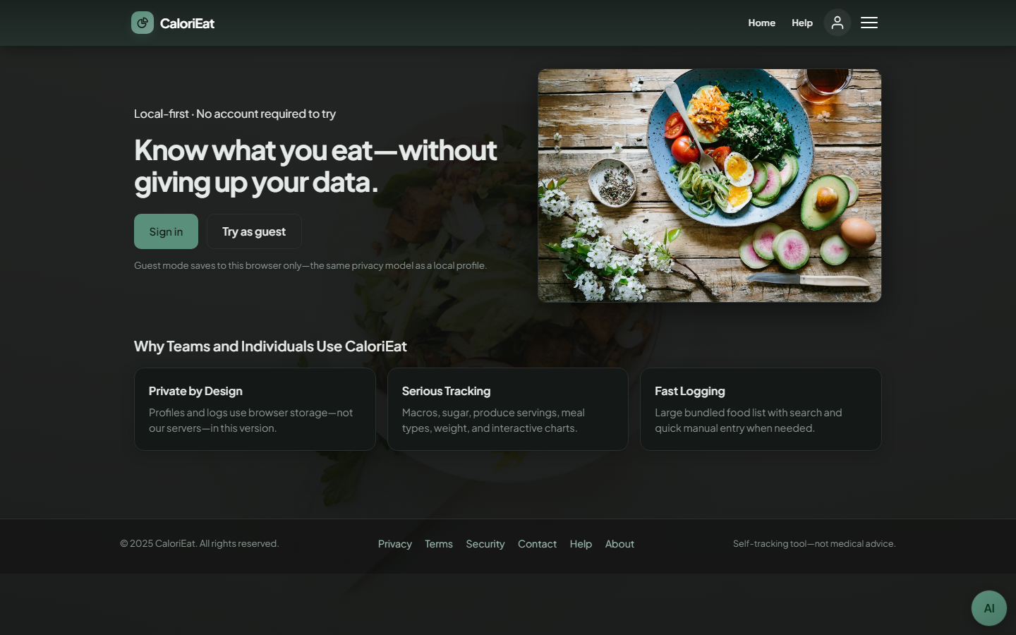
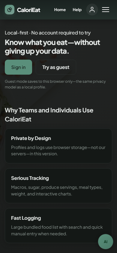
UHCL Software Engineering capstone (SWEN 6837, with Michael Chavez): meal logging, macros, weigh-ins, goals, and Chart.js dashboards in the browser. Feature inventory, architecture, testing, and screenshots are in the case study.
Highlights
- Capstone — Requirements and diagrams, architecture and detailed design, user manual, backend/DB, and testing alongside Michael’s UI and integration focus.
- After graduation — Fork for my GitHub Pages demo, hosting cleanup and welcome-first entry, UI polish; changes merged back to the canonical team repo via pull requests.
Mockups: capstone-era dashboard vs. today’s welcome flow. Snapshot, diff, and full timeline are in the case study.
Impact
Co-owned capstone scope and documentation; after launch, kept iterating and landed changes through review on the team repo.
Summary
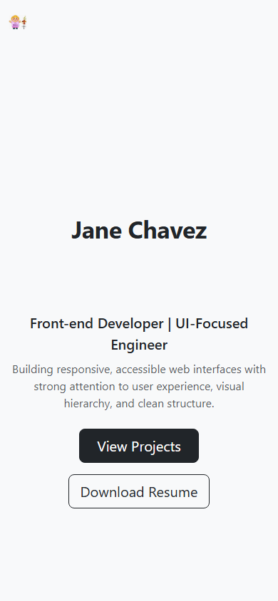
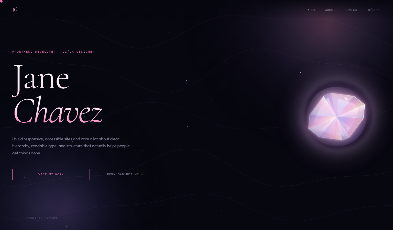
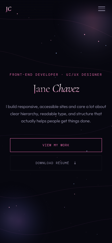
The site you’re on: a hand-coded portfolio on GitHub Pages—Bootstrap 5 first for speed, then a custom CSS and vanilla JS rebuild (canvas, motion, nav, résumé page) so it matches my Figma direction. No React here on purpose.
I keep this row short; the case study has goals, v1/v2 process diagrams, technical notes, legacy demo, Bootstrap-era source, and the revamp commit—without repeating it all here.
Summary
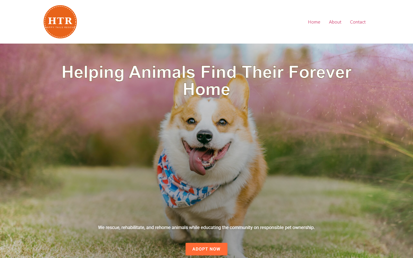
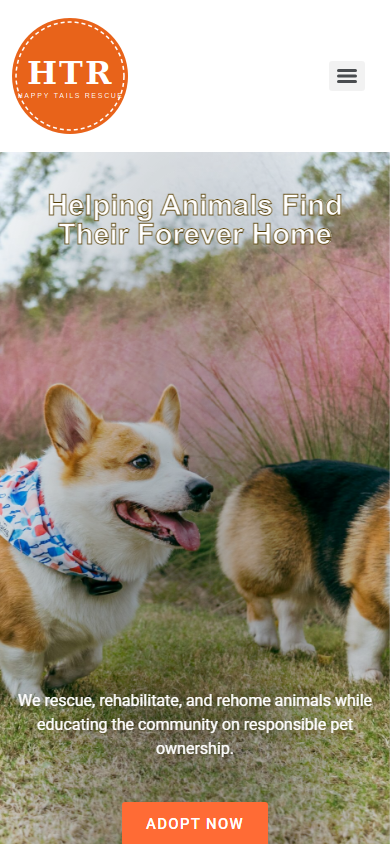
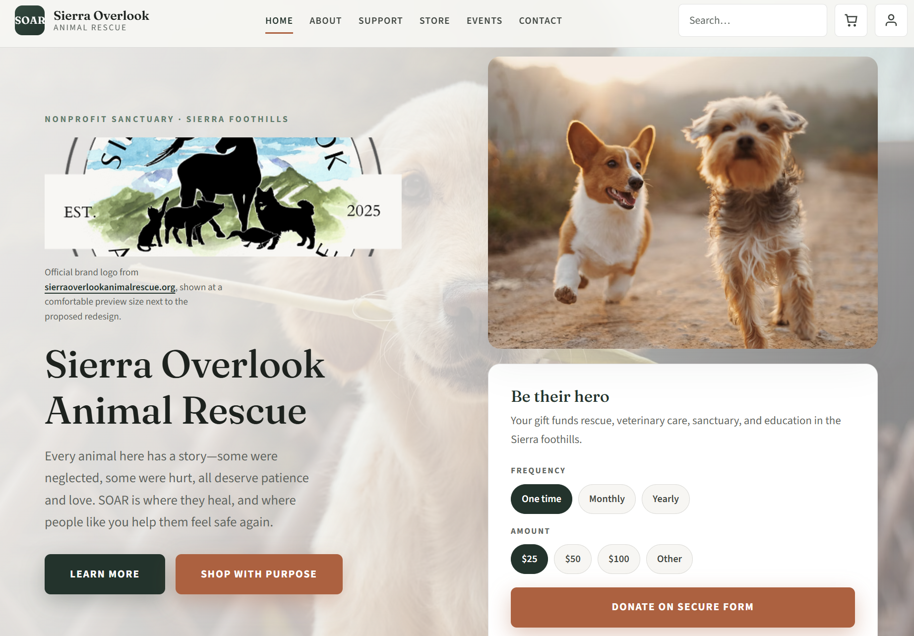
Three approaches to the same client — Sierra Overlook Animal Rescue, a 501(c)(3) nonprofit sanctuary in California. I came in as a volunteer UX designer, optimized their live Wix site with the Executive Director, then built two independent redesigns to push my thinking further: a full from-scratch HTML/CSS/JS multi-page site and a WordPress prototype. Together they show how I work inside platform constraints and what I build when the canvas is open.
What's included
- Wix optimization — Improved desktop navigation visibility, hero balance, services layout, footer clarity, and event readability on the live site. Real stakeholder, real constraints, phased delivery.
- HTML redesign demo — Full multi-page build from scratch with stronger hierarchy, uniform profile framing, clearer event organization (live/upcoming/past), and more polished partner/footer presentation. Semantic HTML, CSS, vanilla JavaScript, GitHub Pages.
- WordPress prototype — Self-hosted WordPress + Elementor practice build showing CMS layout and form integration skills.
Highlights
- Three tools, one client, one consistent design direction
- Stakeholder collaboration on the live Wix experience, including platform-constraint communication and practical UX decisions
- Independent initiative to test a more refined, less visually heavy experience when platform limits are removed
Summary
Focused hero exploration in Figma—type, spacing, and device frames that read intentional in interviews, not like a quick comp.
Approach
- Layout — Desktop hero structure and reflow thinking in Figma.
- Systems — Typography scale and spacing tokens I can reuse on other screens.
- Presentation — Project art placed in phone and desktop frames; exports at usable resolution.
Impact
Shareable Figma file and prototype links—quick proof of UI craft when hiring teams ask for design samples (no production case study for this one).
Summary
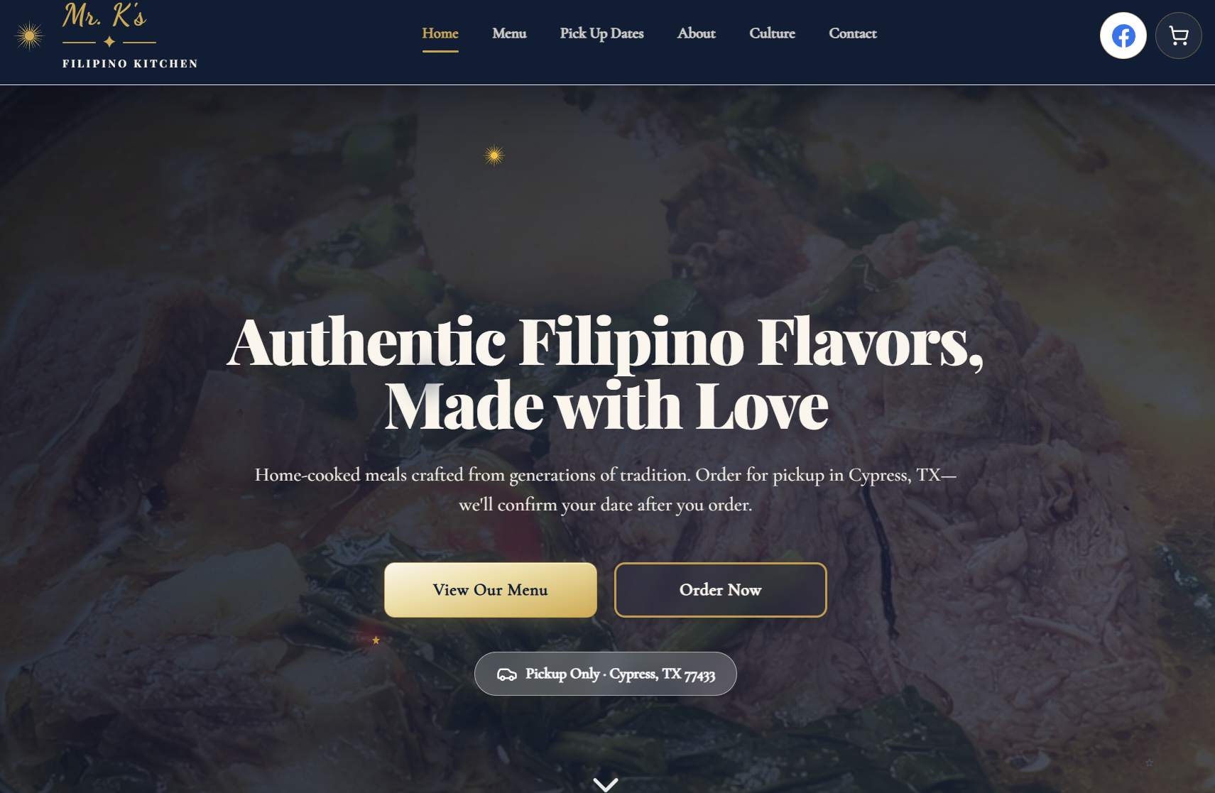
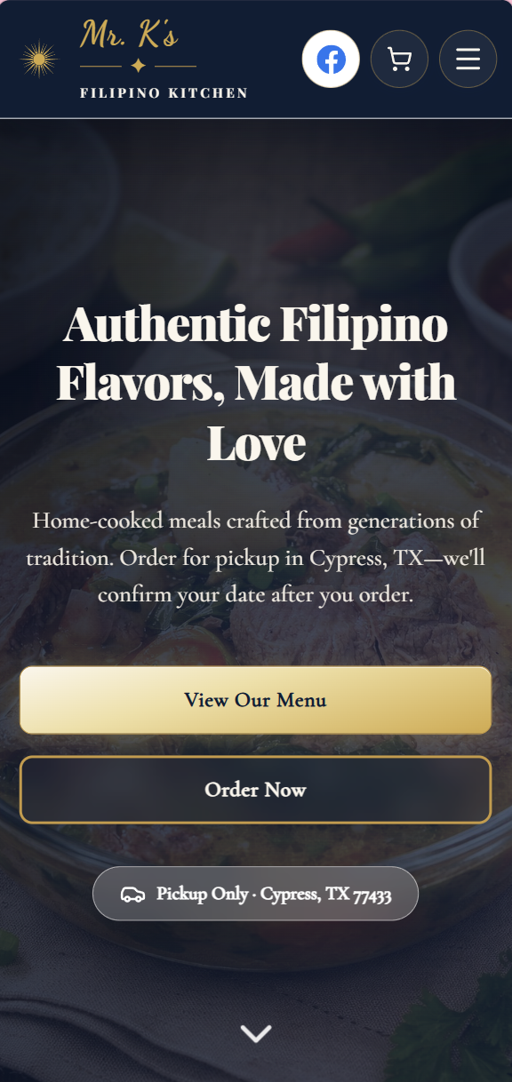
A full-stack food ordering website I designed and built from scratch for my family's Filipino home kitchen business in Cypress, TX. Customers can browse the menu, place orders with payment, select pickup dates from a live availability calendar, and submit custom dish inquiries. Built with Next.js and deployed on Vercel — a real production site serving real customers.
What's included
- Menu and ordering system — Full menu with item details, sizing options, and a checkout flow with payment integration
- Pickup calendar — Live availability calendar where customers select their preferred pickup date and time window
- Custom order inquiry — Contact flow for customers to request dishes not on the menu
- SEO optimization — Meta tags, structured data, and performance tuning for local search visibility in Cypress, TX
- Culture and education pages — Dedicated pages sharing Filipino heritage, stories, and food culture
- Email subscription and Facebook integration — Newsletter signup and social presence connected to the business
- Print-ready business card — QR code business card page designed for physical handouts at markets and events
- Community poll — Interactive voting feature for customers to vote on new menu items
Highlights
- Production site serving real customers and processing real orders
- Full design-to-deployment ownership — concept, UI, code, and launch
- Next.js and Vercel stack demonstrates modern full-stack front-end capability
- SEO-optimized for local food business discovery